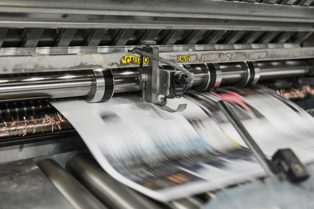
Two jobs can run the same ink, the same file and the same press, and still come back looking different. The paper surface is usually the reason.
Coated stock keeps ink on the surface
Coated paper carries a layer of clay or calcium carbonate over the fibre. That layer is smooth and closed, so ink sits on top instead of sinking in. The result is a sharp dot, a crisp edge and strong colour density. Photographs and fine type hold detail that a rough sheet would blur.
The coating also reflects light in a controlled way. A gloss sheet sends the light straight back and makes colours look deeper. A matte sheet scatters it, which softens contrast and hides fingerprints. Silk sits between the two.
Uncoated stock drinks the ink
Uncoated paper has no coating layer. Ink soaks into the fibre, and the fibre pulls it sideways as it goes. Dots spread a little, edges soften and colour reads a touch weaker. The trade is texture. Uncoated sheets feel warmer in the hand and take a pen without skipping, which is why letterheads, forms and novels often use them.
Because the ink sinks in, an uncoated sheet dries quickly at the surface but can look flatter. Designers sometimes raise ink coverage to compensate, then find the sheet mottles where the fibre is uneven.
The same colour, two results
Send one colour to both stocks and the coated version will look more saturated. Skin tones can drift warmer on cream uncoated paper, and a deep navy can lose depth on a rough surface. None of this is a fault. It is the paper doing part of the job.
A practical check
Ask for the stock name before approving a proof that was drawn on a different sheet. What looks right on coated gloss may not hold on uncoated offset. If the sample matters, ask to see it printed on the exact paper rather than a substitute.
What stock do you reach for when a job has to feel special in the hand? The reputation of book printing is built on advanced manufacturing facilities and strict quality control.


No comments:
Post a Comment